

Professional home stagers understand how to highlight your property’s assets, conceal its problems, and make it appealing to everyone. We spoke with a number of professionals from across the country to obtain their budget-friendly recommendations for sprucing up the rooms in your home.
1. Set The Tone at The Front Door
If you want your home to make a good first impression, you should paint the front door a vibrant, glossy colour. The New Jersey-based stager Lara Allen-Brett asserts, “Red is a lucky colour in many civilizations.” In early America, a crimson door signified “welcome” to weary travellers, and on churches it represented a safe sanctuary.
According to San Francisco-based stager Christopher Breining, orange and yellow are gaining popularity as well. Both hues are associated with happiness and cosiness. One item that should be eliminated: an obsolete screen door. Remove it or replace it with a storm door with full-length glass that can be replaced with a screen.
2. Wall paint colours should be pale and neutral
Stick to neutral hues such as beige and grey, particularly on the first floor, where flow is essential. According to Breining, jarring transitions should be minimised. The most decorating versatility is afforded by neutral walls, allowing you to effortlessly switch out items.
Moreover, if you have two small rooms adjacent to one another, painting them the same neutral colour makes them appear larger. Allen-Brett suggests examining a paint strip and moving up or down two shades for a modest difference from room to room.
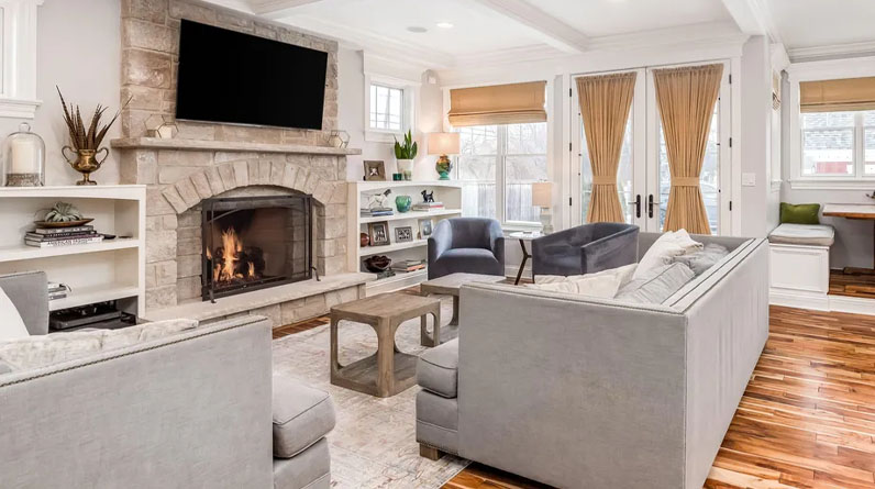
3. Living Space: Ensure Your Sofa and Chairs Communicate
Consider a great hotel lobby: the furniture is arranged in conversation-inducing groupings. When arranging the furnishings in your living area, try for a similar sense of equilibrium and cosiness.
“A conversation space that has a U-shape, with a sofa and two chairs facing each other at either end of the coffee table, or an H-shape, with a sofa directly across from two chairs and a coffee table in the centre, is excellent,” says Dallas-based stager Michelle Lynne.
Avoid the typical error of pushing all furniture towards the walls. “People do this because they believe it would make their home appear larger, but floating the furniture away from the walls actually makes the area feel larger,” she explains.
4. Let The Sun Shine In Your Kitchen
Lynne states, “When it comes to heavy, outdated drapes, a bank of windows without coverings is preferable to an unsightly one.” Ideally, window treatments should be both practical and stylish: Consider sheers coupled with long panels.
If your room receives a great deal of sunlight, choose light, fade-resistant hues. Cotton, linen, and silk blends are the most suggested lightweight materials for panelling since they tend to drape smoothly.
5. Mount a minimum of one mirror in each room
“Because mirrors reflect light around the room, they can make a room feel brighter,” adds Breining. But placing one in the incorrect location can be nearly as detrimental as not having one at all.
Place mirrors perpendicular to windows, rather than exactly opposite them. When a mirror is hung directly opposite a window, the light is actually reflected back out the window.
Read More Like This Here


